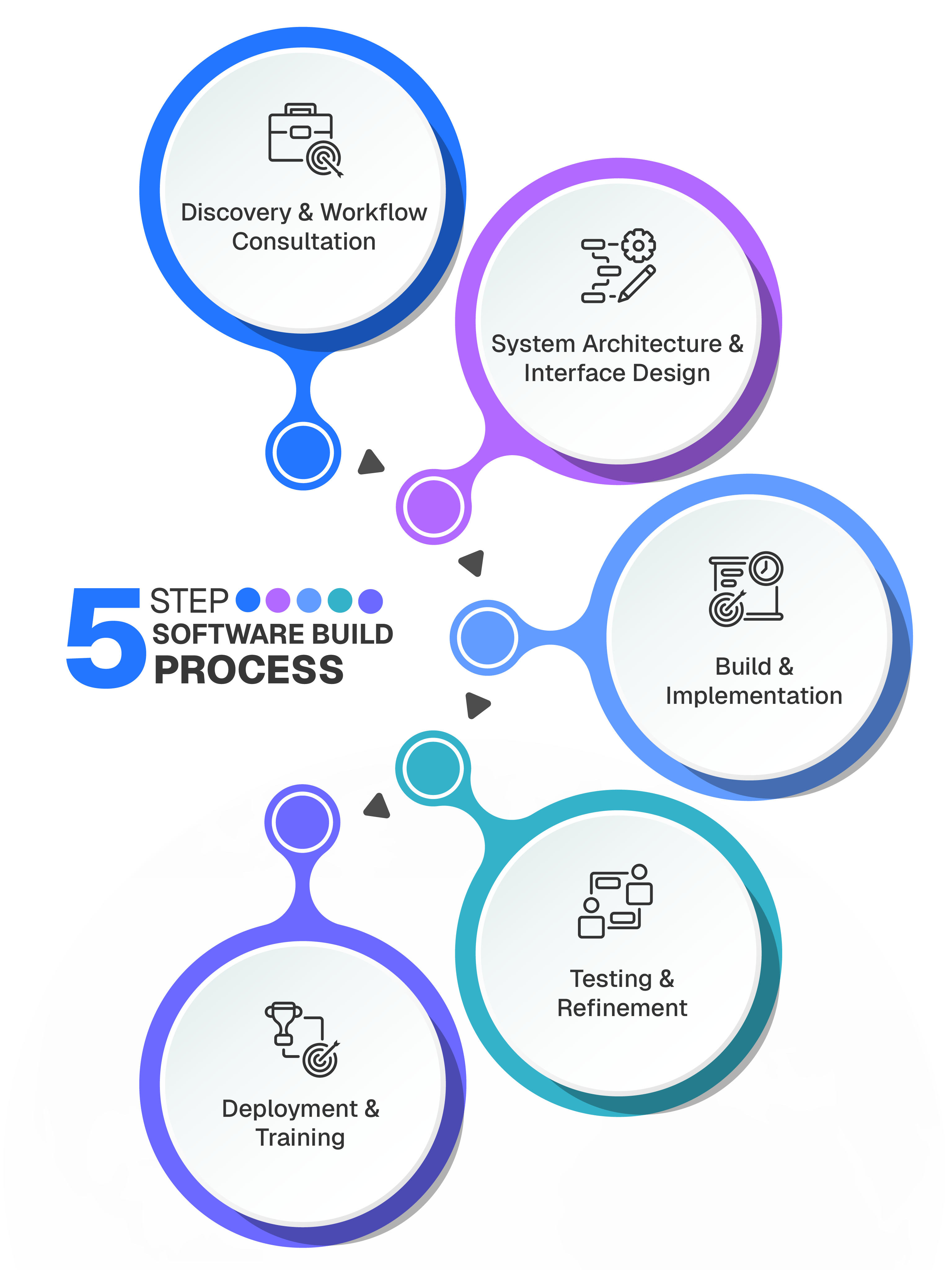
Experience our 5-Step software building process
Operational software built around your workflows.
Purpose-built operational software for established businesses that need more than generic tools. We design systems that align with your processes, data, and long-term growth.
Technologies we have worked with

Bespoke custom business software
When off-the-shelf software starts slowing your business down, it’s time for something built for you. Our bespoke systems are designed around your workflows, giving you control, clarity, and efficiency.
No unnecessary features
Your system contains only what your business actually needs.
Faster workflows
Tasks that normally take minutes or hours can be completed in seconds.
Software your team actually enjoys using
Clean interfaces and logical workflows improve adoption.
Automated operational intelligence
Trigger alerts, approvals, and actions automatically.
Complete ownership of your platform
You control the roadmap instead of waiting for vendor updates.
Technology that grows with your ambition
Expand functionality whenever your business needs it.
Frequently Asked Question
Clear answers to common questions about how the framework works and when it is most useful.
-
What types of solutions can you build with FileMaker?
We build custom FileMaker solutions such as CRM systems, ERP tools, inventory management, reporting dashboards, project tracking, HR systems, and custom admin panels. Each solution is designed specifically around your business processes, not generic templates.
-
Can FileMaker integrate with other systems?
Yes. FileMaker can integrate with third-party services and APIs such as REST APIs, accounting software, payment gateways, email services, and more. We regularly build integrations to ensure FileMaker fits seamlessly into your existing tech stack.
-
Is FileMaker secure and suitable for business use?
Absolutely. FileMaker includes strong security features such as user authentication, role-based access control, encryption, and secure server deployment. We also follow best practices to ensure your data is protected and scalable as your business grows.
Ready To Build Software That Fits Your Business?
If you’ve outgrown generic tools, it might be time for something designed around your workflows. Tell us about your business and we’ll take the first step together.
Articles & Resources
Custom software articles and client case studies

The Structural Mismatch Between Fashion Ecommerce Operations and Generic Software
Read more →
Your Shopify App Stack Is Probably Fine. Until It Isn't.
Read more →
Insight
When Your Fashion Brand Outgrows Its Ecommerce Stack
When Your Fashion Brand Outgrows Its Ecommerce Stack
Read more →